
After 4 years of eager anticipation, another massive World Cup is now behind us. So, what kind of global vision did we gain from the design team behind this colossal event? Let’s take a look together.
From Cultural Symbols to a 'Photorealistic' Canvas: The Transformation of the Emblem
Past World Cups featured dynamic, illustrative, and colorful emblems that reflected the local culture. Whether it was the geometric lines inspired by the Op-Art movement in Mexico '70 or the sculptural 3D form derived from the Arabian shawl in Qatar '22, the host country's cultural footprint was summarized within a single emblem.
1970 Mexico Logo Source: Mexico 1970 Logo (Wikimedia Commons)
2022 Qatar Logo Source: Qatar 2022 Official Emblem (Wikimedia)
For the 2026 emblem, FIFA broke all the rules: they placed an actual (photorealistic) photograph of the World Cup trophy right in the center of a huge, flat black-and-white "26". This radical move immediately split the design world in two: while some criticized it as "lazy design / corporate coldness," others defended it as a "bold system design." However, when we dive deeper into the design, we see a much larger strategic vision behind this decision.
2026 FIFA World Cup Official Emblem: Official FIFA 2026 Emblem
Breaking the Clichés: Multi-Centric Brand Architecture for 16 Cities
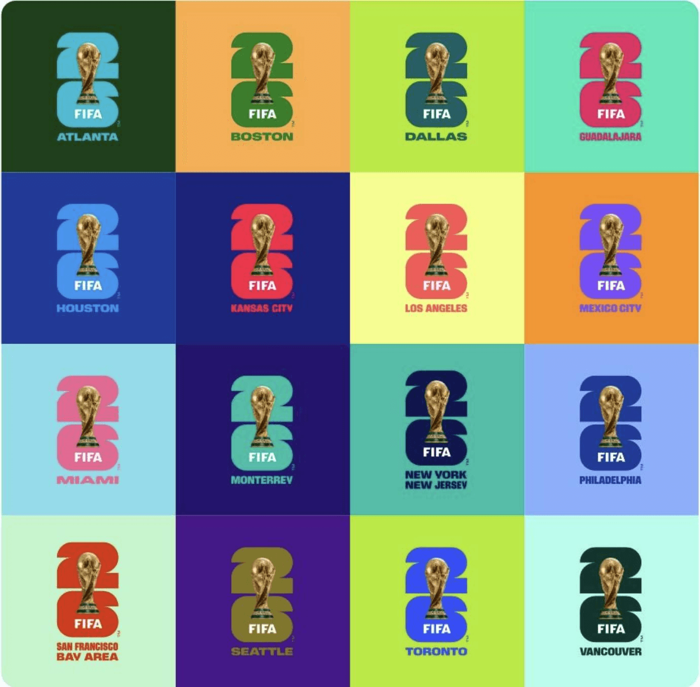
You cannot brand a tournament spanning 16 different metropolises across the USA, Canada, and Mexico using traditional methods. Instead of resorting to cultural clichés (such as stereotypical symbols like a Sombrero, the Statue of Liberty, or a maple leaf), FIFA kept the main logo as a neutral overhead umbrella for the first time in history, while creating custom child brands and typographic color palettes for each of the 16 host cities (Los Angeles, Mexico City, Toronto, etc.)
16 Cities Visual Architecture Example: Graphix Pyramids – The Branding Elements Behind FIFA
From the Pacific sunset hues of Los Angeles to the rich local colors of Mexico City, every city expressed its own visual language on this flexible canvas provided by the primary logo. As a result, the branding moved beyond superficial souvenir design into a genuine "Community-Centric" and "Storytelling" foundation.
An Anatomical Perspective: A Holistic System Shaping the Brand Identity
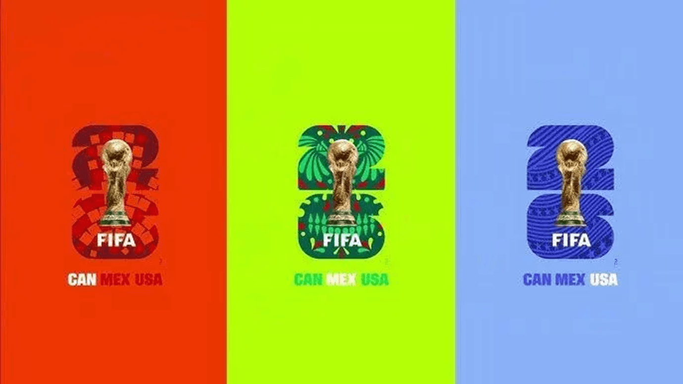
What merges the visual language of FIFA 2026 into a single cohesive experience is its fluid design anatomy, where every element feeds into the next. The system transforms the massive "26" at the center of the emblem from a static visual into a dynamic "Window Device" that can be filled with street culture, fan faces, videos, and urban textures.
The editorial integrity of this flexible canvas is provided by "FWC 2026", a custom-designed official typeface inspired by street football and vintage poster aesthetics. Noto Sans, added as a secondary font, ensures seamless legibility across multi-language applications. When this versatile typographic structure combines with a digital-first, high-contrast color palette featuring electric green, Pacific violet, and terracotta red that go well beyond traditional field greens and flag tones the result is a living, "Motion-First" ecosystem that feels naturally at home everywhere from print media to LED displays.
Ultimately, the core truth proven to us by the 2026 World Cup is that the success of mega-brands no longer lies in monolithic, unshakeable symbols, but in these breathing micro-stories living inside a dynamic system.
Micro-Stories Are Stronger Than Clichés
At exitworks.studio, we believe that brands should tell their own authentic, living micro-stories that resonate with their community, rather than hiding behind cliché symbols. To break through clichés and build a flexible, memorable, and timeless visual system for your brand, you can reach out to us via exitworks.studio