REGEN
aesthetic medical
BRAND IDENTITY + VISUAL DIRECTION + PRINT
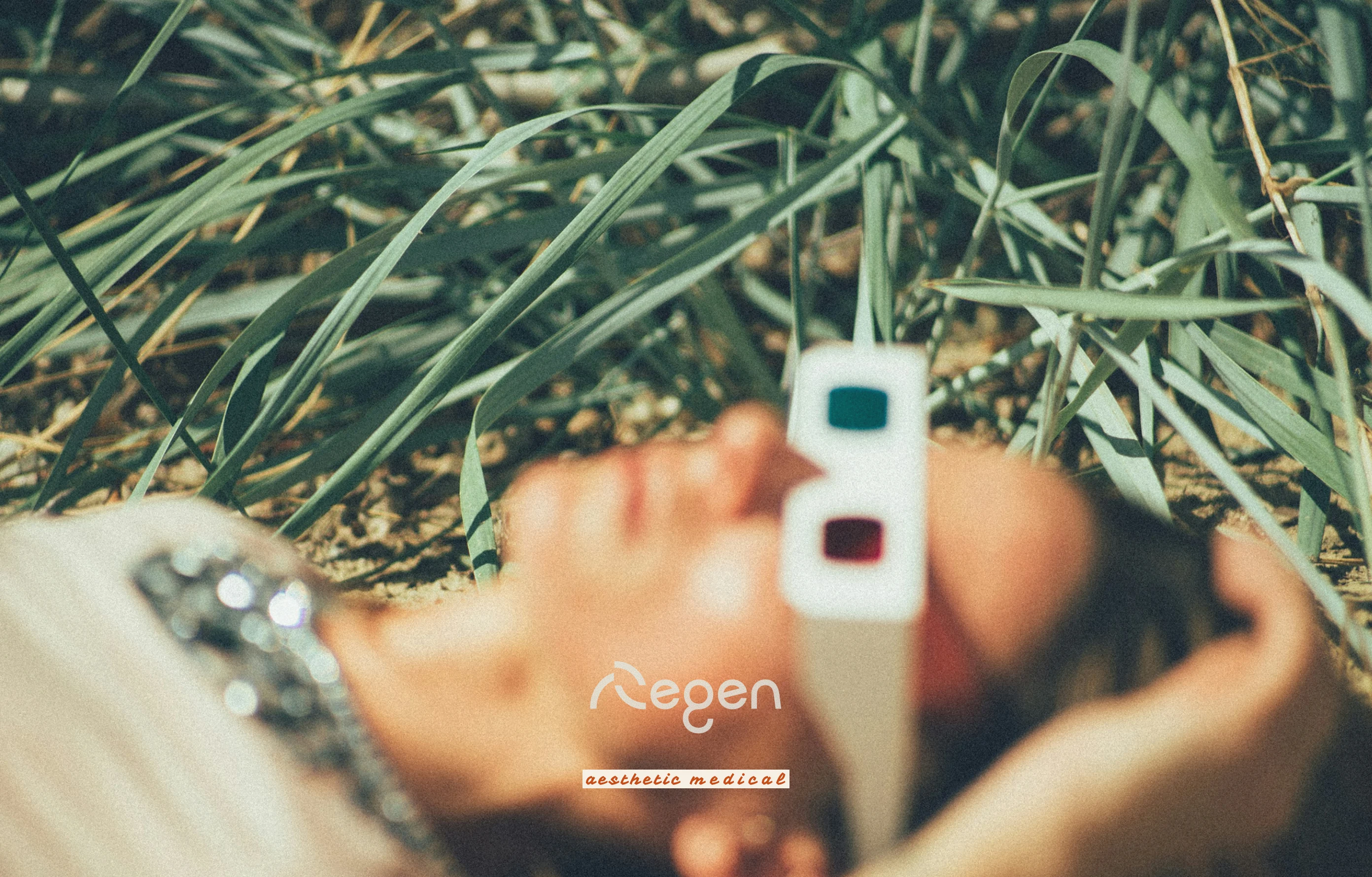
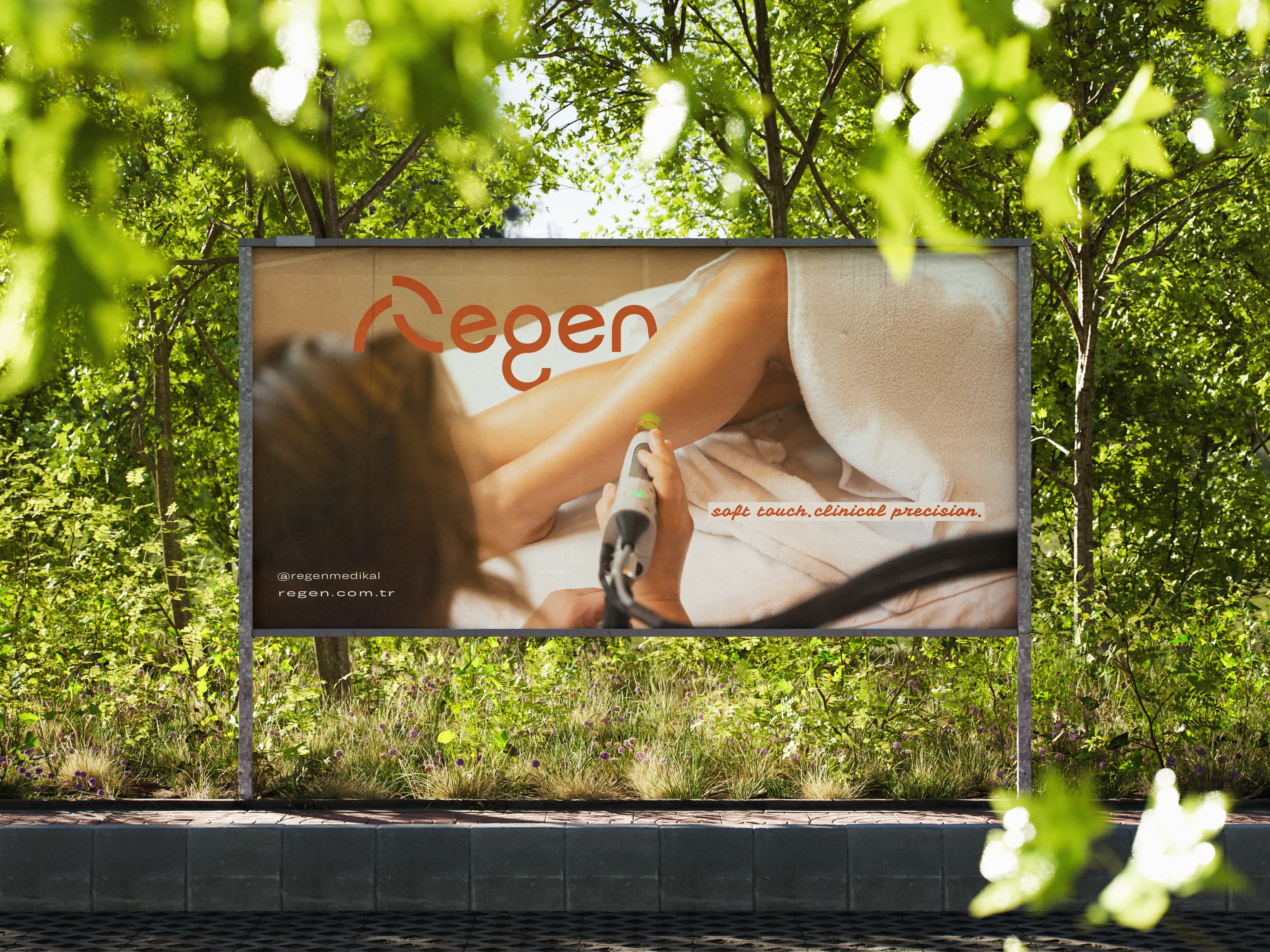
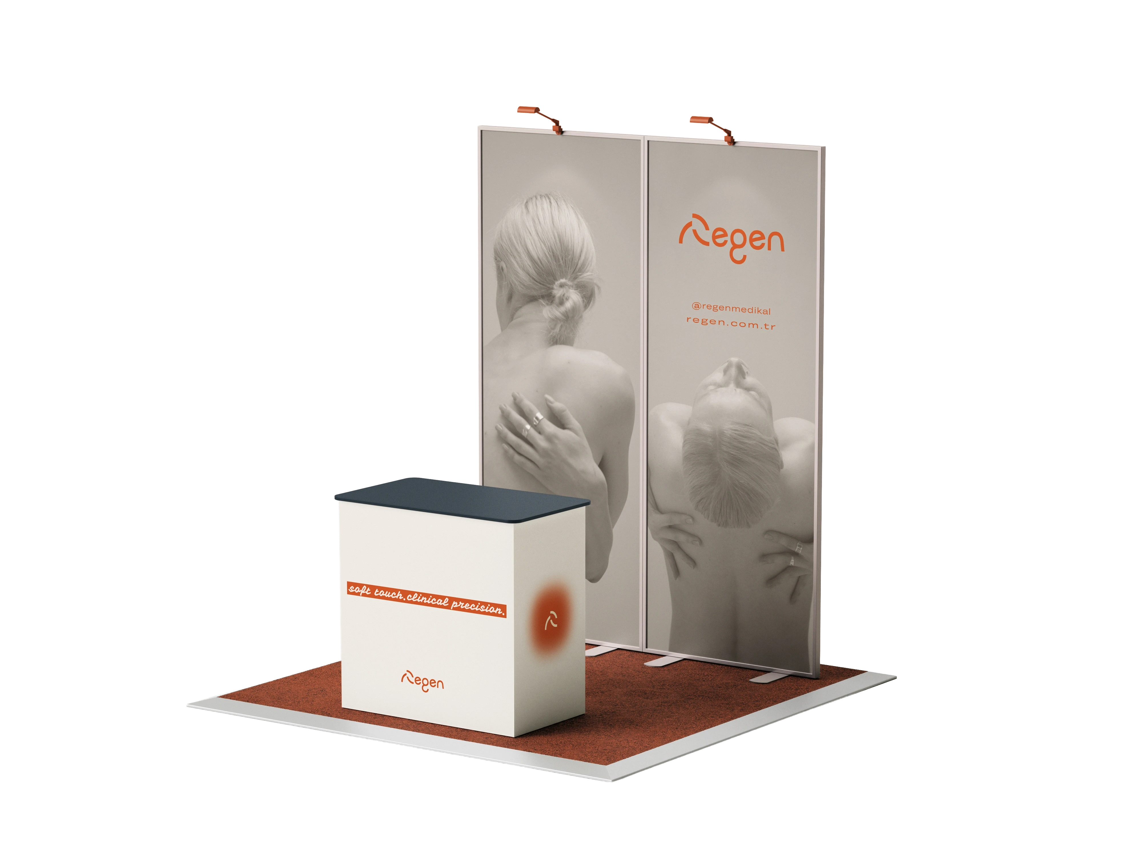
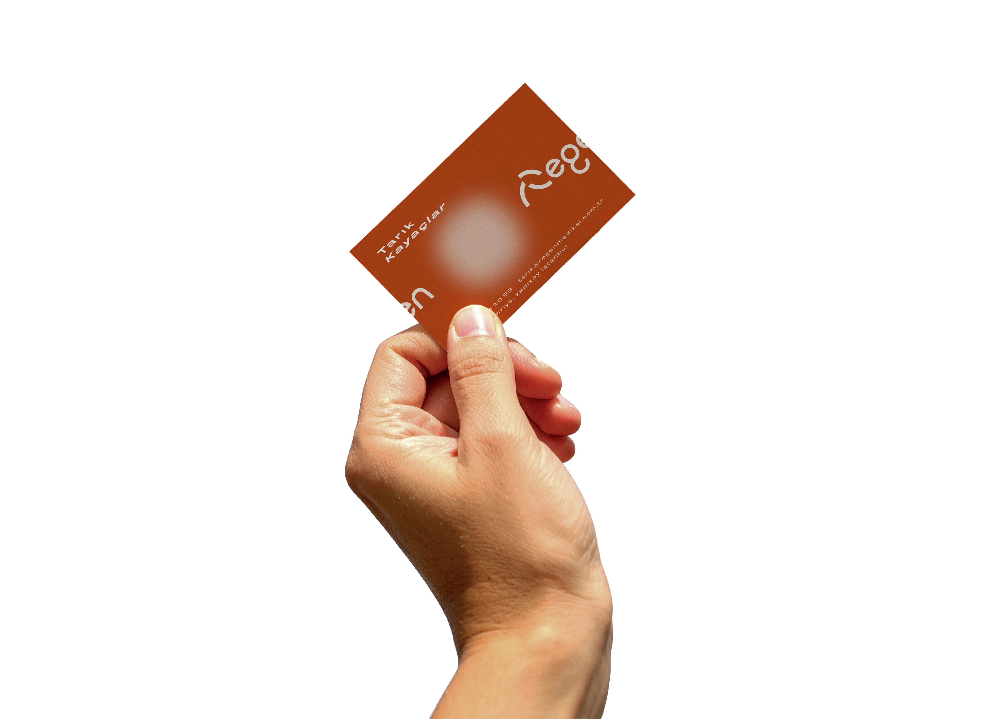
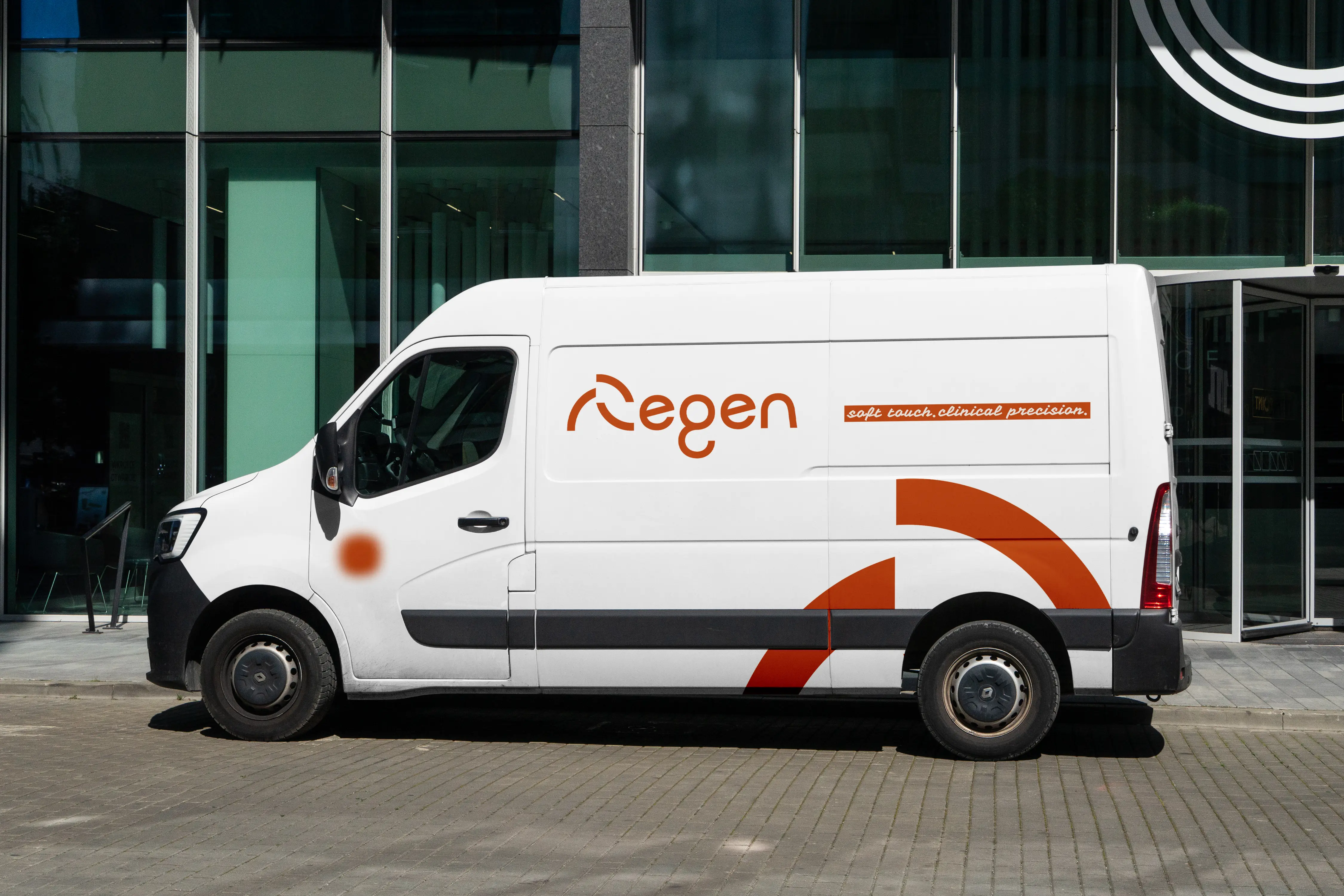
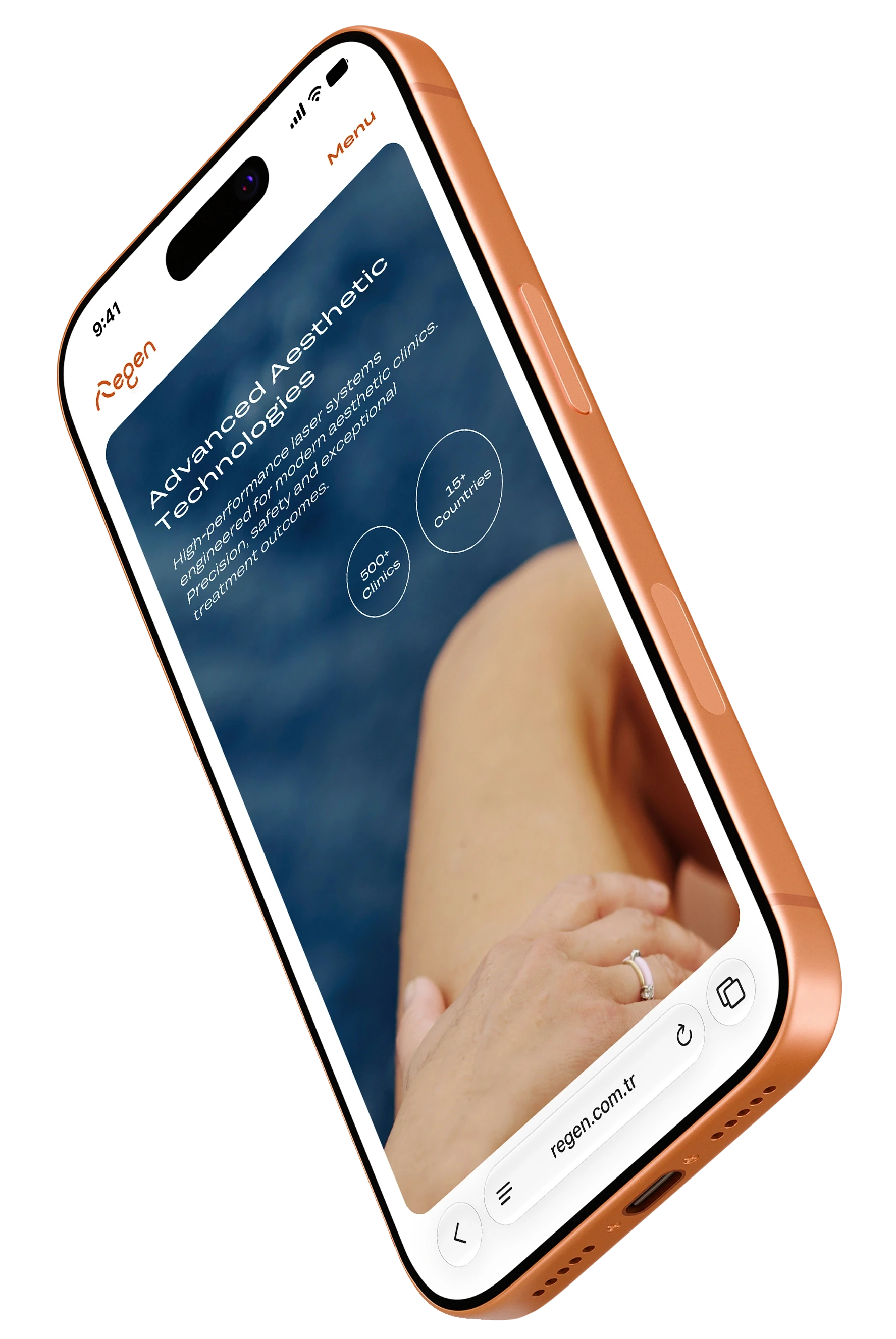
For Regen, we wanted to move beyond the traditional visual language of the medical industry. Instead of creating a brand that feels clinical, we designed a system that balances advanced technology with a premium, approachable aesthetic. Every component from the identity system to its real-world applications was developed to express innovation, reliability, and long-term brand consistency.
REGEN
aesthetic medical
BRAND IDENTITY + VISUAL DIRECTION + PRINT
For Regen, we wanted to move beyond the traditional visual language of the medical industry. Instead of creating a brand that feels clinical, we designed a system that balances advanced technology with a premium, approachable aesthetic. Every component from the identity system to its real-world applications was developed to express innovation, reliability, and long-term brand consistency.
REGEN
aesthetic medical
BRAND IDENTITY + VISUAL DIRECTION + PRINT
For Regen, we wanted to move beyond the traditional visual language of the medical industry. Instead of creating a brand that feels clinical, we designed a system that balances advanced technology with a premium, approachable aesthetic. Every component from the identity system to its real-world applications was developed to express innovation, reliability, and long-term brand consistency.
REGEN
aesthetic medical
BRAND IDENTITY + VISUAL DIRECTION + PRINT
For Regen, we wanted to move beyond the traditional visual language of the medical industry. Instead of creating a brand that feels clinical, we designed a system that balances advanced technology with a premium, approachable aesthetic. Every component from the identity system to its real-world applications was developed to express innovation, reliability, and long-term brand consistency.

R
we touch. but gently.
we touch. but gently.
we touch. but gently.
we touch. but gently.
we touch. but gently.
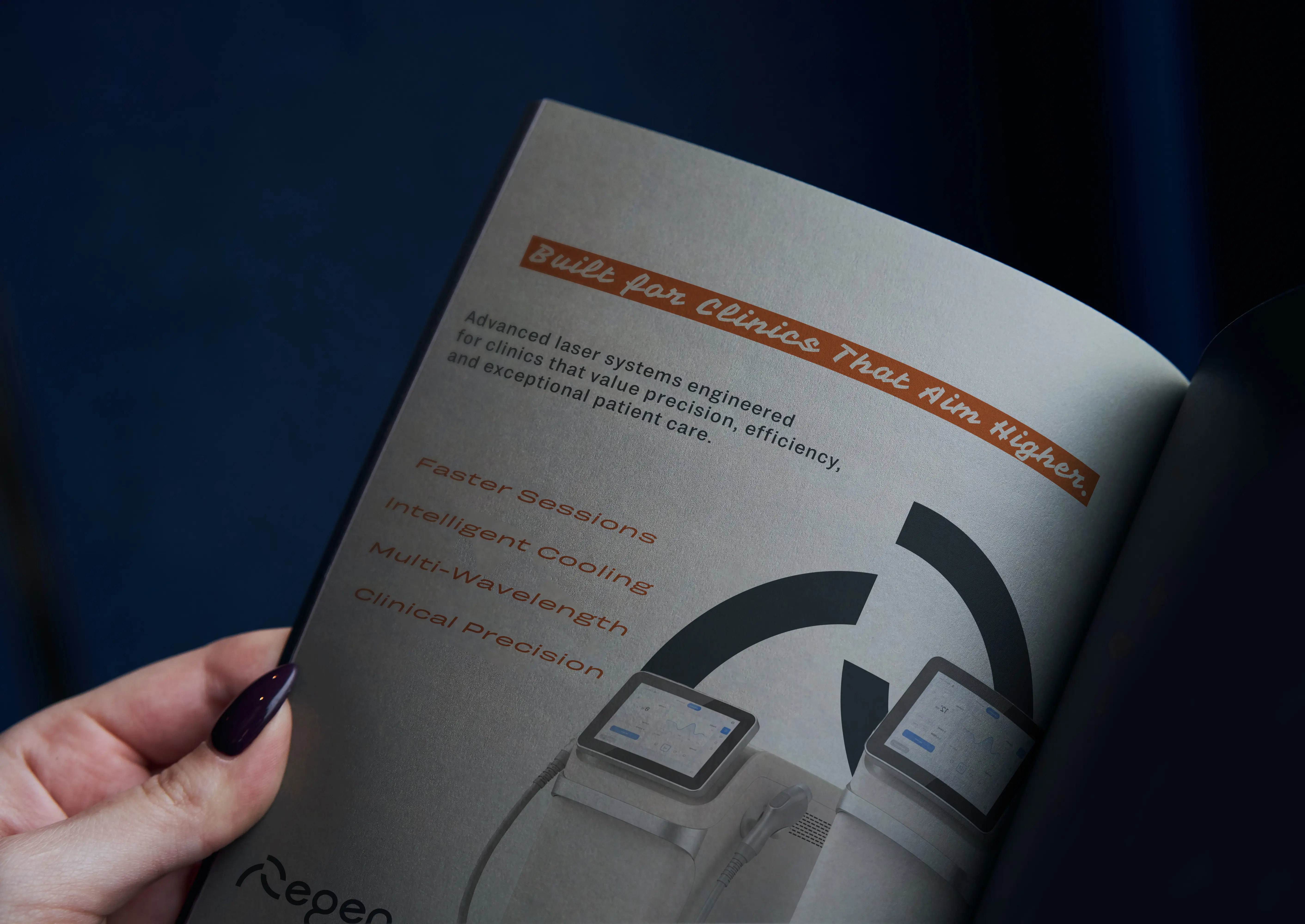

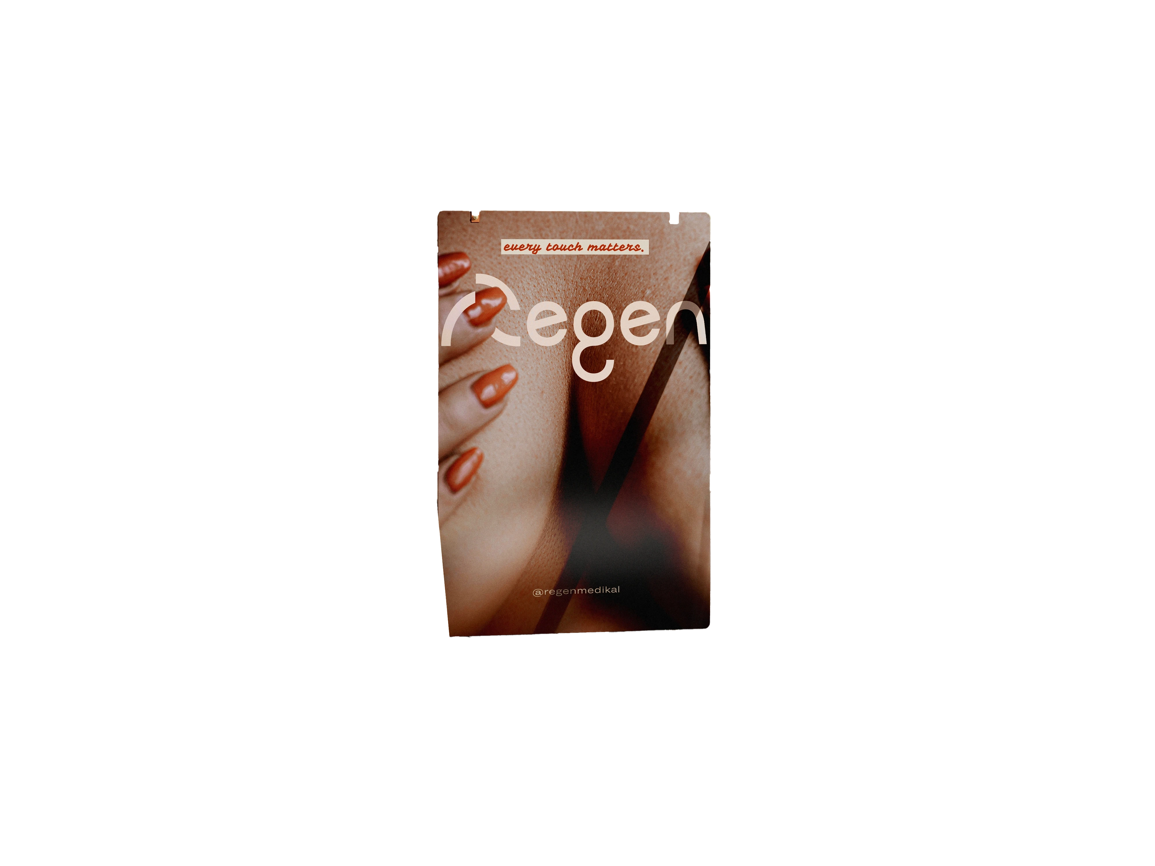
Rather than choosing between precision and personality, we brought both into a single typographic system. GRTSK establishes a clean, contemporary foundation, while Vampiro One gives the brand its distinctive voice. Together, they create a typographic identity that feels consistent, memorable, and unmistakably Regen across every touchpoint.
Rather than choosing between precision and personality, we brought both into a single typographic system. GRTSK establishes a clean, contemporary foundation, while Vampiro One gives the brand its distinctive voice. Together, they create a typographic identity that feels consistent, memorable, and unmistakably Regen across every touchpoint.
Rather than choosing between precision and personality, we brought both into a single typographic system. GRTSK establishes a clean, contemporary foundation, while Vampiro One gives the brand its distinctive voice. Together, they create a typographic identity that feels consistent, memorable, and unmistakably Regen across every touchpoint.
Rather than choosing between precision and personality, we brought both into a single typographic system. GRTSK establishes a clean, contemporary foundation, while Vampiro One gives the brand its distinctive voice. Together, they create a typographic identity that feels consistent, memorable, and unmistakably Regen across every touchpoint.

touch.


the care club 2026
the care club 2026
the care club 2026
the care club 2026




EXIT Works
EXIT Works
EXIT Works
EXIT Works
Regen
Regen
Regen
Regen